Sunday, February 26, 2012

I've been busy!


Well hi! How are you?
I was home alone this weekend (Matt went up north to see his son) and went on art and design spree. First project of the weekend: jenniferjohansson.com!


I bought the jenniferjohansson.com domain a while back and finally decided to do something with it when I came across an easy to use artist website builder.  Schmolio.com was created by the husband of an artist/Rockford friend of mine, Amy Sacksteder.  Mark helped Amy create her site and then decided to help others create sleek, easy to navigate artist portfolio sites.


In just a few hours, I had uploaded 5 albums worth of images, posted my resume and artist statement, and added some contact info. Schmolio even walked me through the steps of pointing my domain name to this site. The whole process was quite easy and I'm really happy with the way it looks!

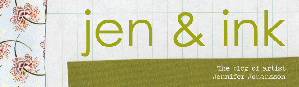
After getting jenniferjohansson.com up and running I turned my attention to my blog. If you are reading this post, hopefully you've noticed the changes. I was tired cluttered look of the sidebar, with all the little links to my other social media accounts. (I should have taken a screen shot of it, shoot!) After doing some research on some of my favorite artful blogs, seeing how others handled links, I decided to make my own "buttons".

I scanned in some of my signature papers (brown craft and vintage ledger) and went to town in Photoshop.  I got to put some of my new Photoshop/Illustrator skills to use that I've picked up at my new job. Yes, I got a new part time job, working in the art department at a local graphic design/trade show display company. (I love it!) Every day I work, I pick up a new little trick or a greater understanding of these amazing/challenging programs.

Anyways, back to my buttons. Aren't they cute? I was so happy with the way they turned out that I decided to create a new blog banner and bio in the same theme. I'm even considering new business cards and labels with this theme. Yahoo for good design!

I need to get moving on my next Tinker piece, so I'll say adieu for now. Do tell me what you think of my new portfolio site and blog update.

Ta-ta!

Saturday, February 25, 2012

A Beautiful Day in the Neighbohood.


Well Hi! It's been a while....

I just can't get over the weather we've had in Southern Illinois this week. It was bright, sunny and 70 degrees yesterday! I have to keep reminding myself that it's February.

Matt and I decided to make use of the spring like conditions to explore the tiny, old cemetery that sits just across the street from our house.


This is a really old cemetery......Many of the stones marked 19th century graves, with only a handful from beyond 1970.


This was one of two stones labeled "infant".


All of these were taken with my trusty iPhone 4s. I am continually amazed by the quality of the camera on that phone. I have to admit that my digital SLR barely gets any action these days as it's just too convenient to use my iPhone.

Have a happy weekend friends. Expect some new art up on the blog soon!

Ta-Ta.

Wednesday, February 15, 2012

I Gotta be Me

Hi.

If you've spent anytime on Etsy or Pinterest lately or just follow design/fashion trends, you've probably noticed that the chevron pattern is really hot right now.  Its on clothes, pillows, prints, walls, furniture and floors. Everywhere!


You may have also noticed that yellow and gray are especially trendy colors at the moment.  I mean look at this Etsy search! I didn't search for yellow or gray, just typed in chevron and this was the first page of results.

I like the chevron pattern, and I really like yellow and gray. These are colors that I have used many a time in my work. So I decided to embrace/capitalize on these hottest of trends and create a yellow and gray chevron piece.


This is what I came up with first.........Ugh.

I sort of like the texture that's created with the application of the white gel pen and the playful imperfection of the stripes (I wasn't patient enough to plan or measure). Still, it seemed flat and unimpressive overall.


I decided to add a little dark with a black Micron pen. That did help to give this a bit more dimension and finish, but still, in my view, this piece is a yawn.  What do you think? I looked at it for a day, and decided just to move on for now, and I made this.


"Gotta be Me" utilizes the same color scheme and angularity of the chevron piece, but is indeed more "me".  Is it my most favorite piece I've ever made? No, but it seems more authentic and a whole lot less forced.  I'll probably make a few more like it to really get it right.


There are most certainly some lessons to be had here. We as artists want to sell, and make things that others want to buy, but it shouldn't be our sole reason for creating. Your art needs to make you happy too!  Yes,  it is good to branch out, try new things, and find inspiration from the work of others,  but it's not smart to hop on a bandwagon just because it's hot. We end up making work that seems forced and pedestrian.  And if there are pages and pages of images featuring this hot trend, why make one more?

So friends, do you have any similar experiences/lessons learned from hopping on the bandwagon? I'd love to hear about them!

Ta-Ta for now.

Monday, February 13, 2012

Mary's Chair


Happy Monday friends! I'm not feeling as motivated as I usually am on a Monday. Maybe it's the gray of day.

I just finished up piece #4 in my Tinker Swiss Cottage Museum commission. This chair is found upstairs in Mary's (Mrs Tinker) quarters. I used quite a bit of colored pencil in this piece to create the highlights and shadows.

I was worried that the pink of the "wallpaper" was going to clash with the orange tone of the "wood" paper, but I think those pops of yellow colored pencil help to pull it together.

To see all of the pieces I've created so for Tinker so far, check out my Flickr page. 

I'm off to the gym to work off all of the yum food we ate this weekend while my momma visited.  Ta-ta for now!

Tuesday, February 7, 2012

Along the Line


Ciao, Ciao friends.

I just finished this up today. "Along the Line" measures 14 3/4 inches by 22 inches and was created with collaged paper and Bic pen on watercolor paper.  Just like my last piece, this one was inspired by my Arthouse Sketchbook Project entry, also entitled "Along the Line." See the whole book here.

This is the last piece that I will include in MFA portfolio. I plan to have the whole application in the mail tomorrow! Yahoo!  Feels great to cross that off the list. 

Next, I'll get back to my Tinker Swiss Cottage commission.

Ta-Ta for now!

Friday, February 3, 2012

Intrinsic Design


Greetings and salutations friends. I hope that today finds you happy and healthy.

This is a huge (by my standards) new piece that I recently finished up.  "Intrinsic Design" measures 24 inches high and 19.5 inches wide and was created with collaged paper and a Bic pen on watercolor paper.

I made this piece for inclusion in my MFA application portfolio. An art professor friend of mine recommended that I include some large scale work in the portfolio. Since the average size of my work these days is 8"x10" I tried to really stretch myself in terms of scale with this piece.

I  also wanted to show that I have a little range, that I don't just draw chairs.  This piece grew out of my sketchbook drawings. I find that I often intuitively draw these "holey" spirals there.

Do tell me what you think of this drawing. I'd love to get some feedback.

So much more to tell. Life is in transition. I'm feeling much like this drawing looks right now.....All over the place.

More later. Ta-Ta for now.

Wednesday, February 1, 2012

Busy!

Greetings Friends!

Lot's of things going on right now and no time to write. Just thought I'd show a few new pieces I've listed in my Etsy shoppe.


Both of these pieces are tiny - just 4" x 4" and come ready to hang.

Happy February. Ta-Ta for now!